Kiln & Kin
Concept — self-initiatedA warm, exacting identity and online shop for a two-person ceramics studio.
Context & challenge
Context
Kiln & Kin is a concept: a fictional studio where two potters make small batches of tableware, sold online and at a weekend studio shop.
Challenge
Craft brands often lean so hard on “handmade” that they look like every other craft brand. The work itself is the opposite of vague: weights, glazes and firing temperatures are tested and recorded.
The identity needed to hold both sides — the softness of thrown clay and the precision of the process.
Creative direction & rationale
Direction
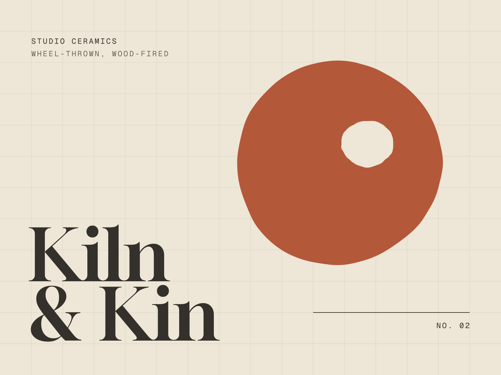
The mark is a single thrown form, slightly irregular, with a thumbprint lifted from its rim. It always sits on a strict grid: the hand inside the system.
A high-contrast serif carries the warmth; a monospaced face carries the facts — codes, clay bodies, glazes, temperatures — exactly as they appear in the studio notebook.
Rationale
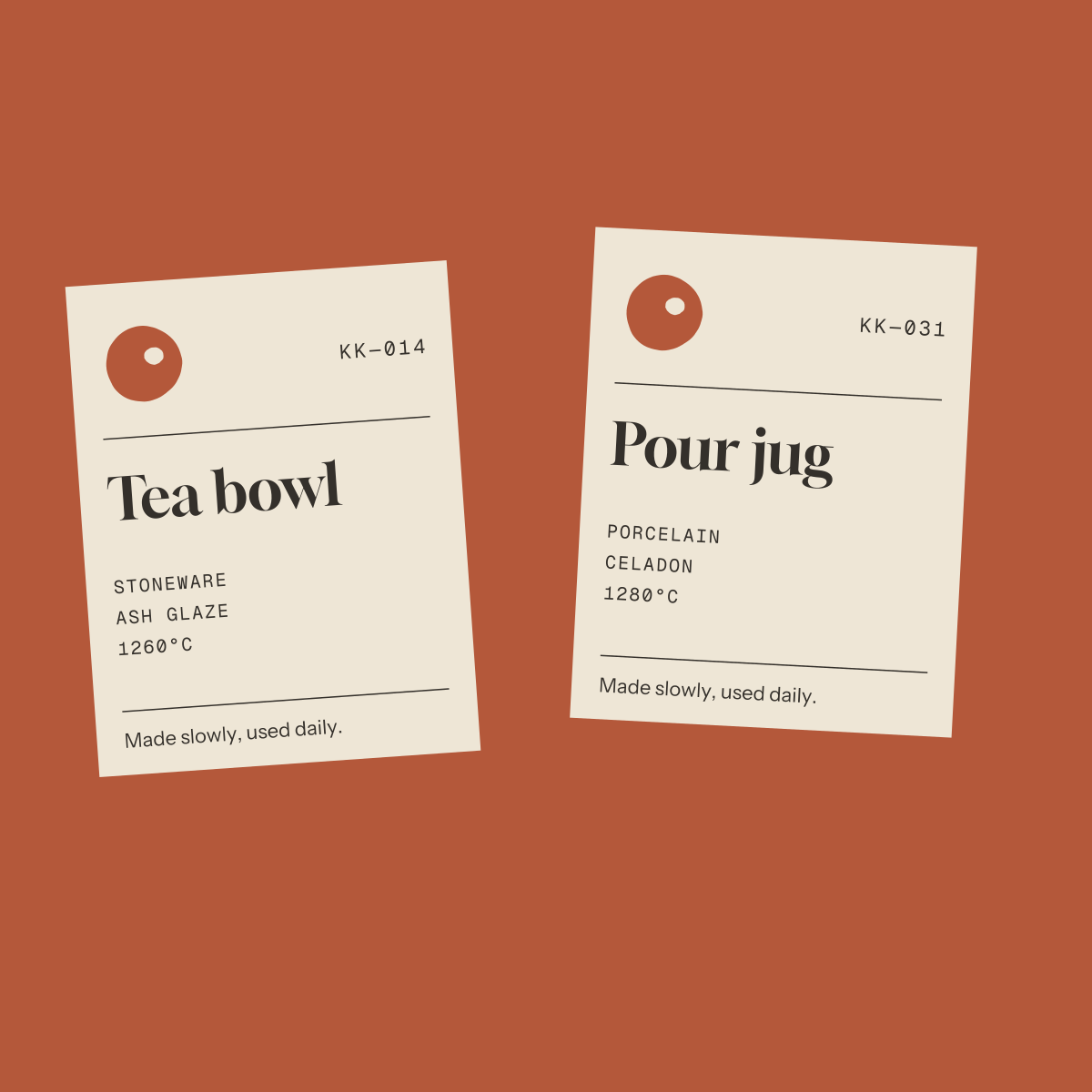
Labels double as records. Each piece ships with its code and firing details, which builds trust and makes reordering a matching glaze simple.
The shop keeps the photography large and the interface quiet: the vessels do the selling, the grid does the organising.
Visual identity
Mark / type / labels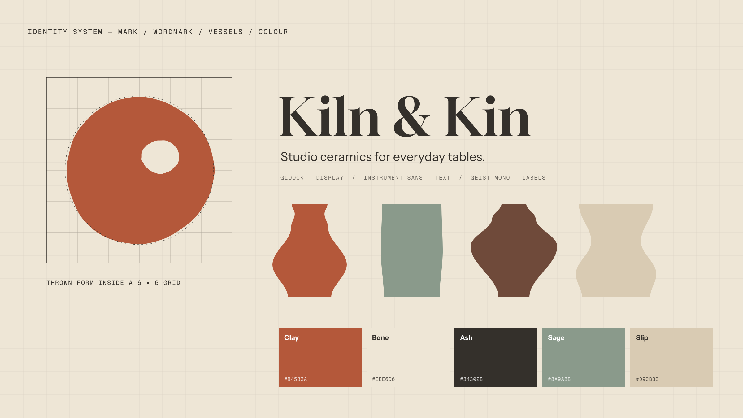
Palette
- Clay#B4583A
- Bone#EEE6D6
- Ash#34302B
- Sage#8A9A8B
- Slip#D9CBB3
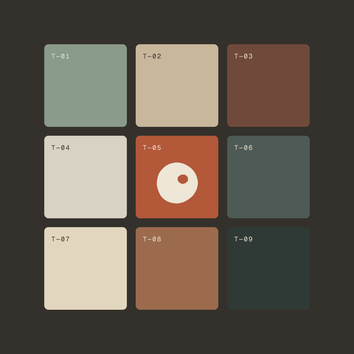
Drawn from the studio: raw clay, bisque, kiln ash and a celadon glaze.
Digital execution
Online shop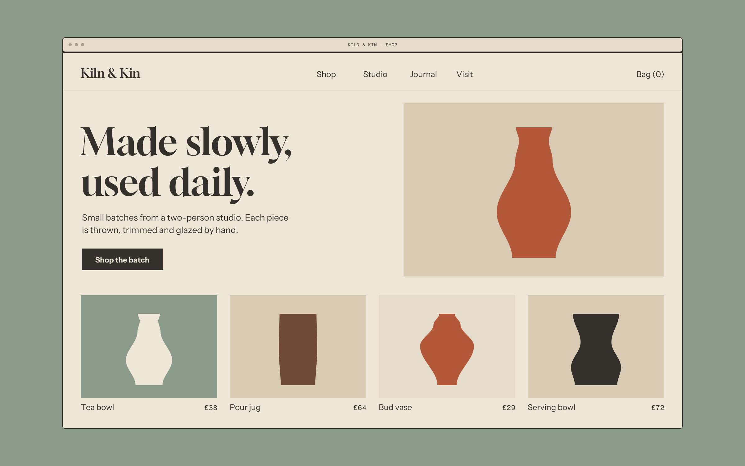
A shop that reads like the studio
Each batch is released as a small, dated collection, so the homepage changes with the kiln schedule rather than with sales campaigns.
Product pages carry the same specification as the label, so the details people ask about are answered before they ask.
Deliverables
Concept — no client results to report- Mark and wordmark
- Type and colour system
- Label and packaging system
- Online shop design and front-end build
Next project 03/03
Back to all work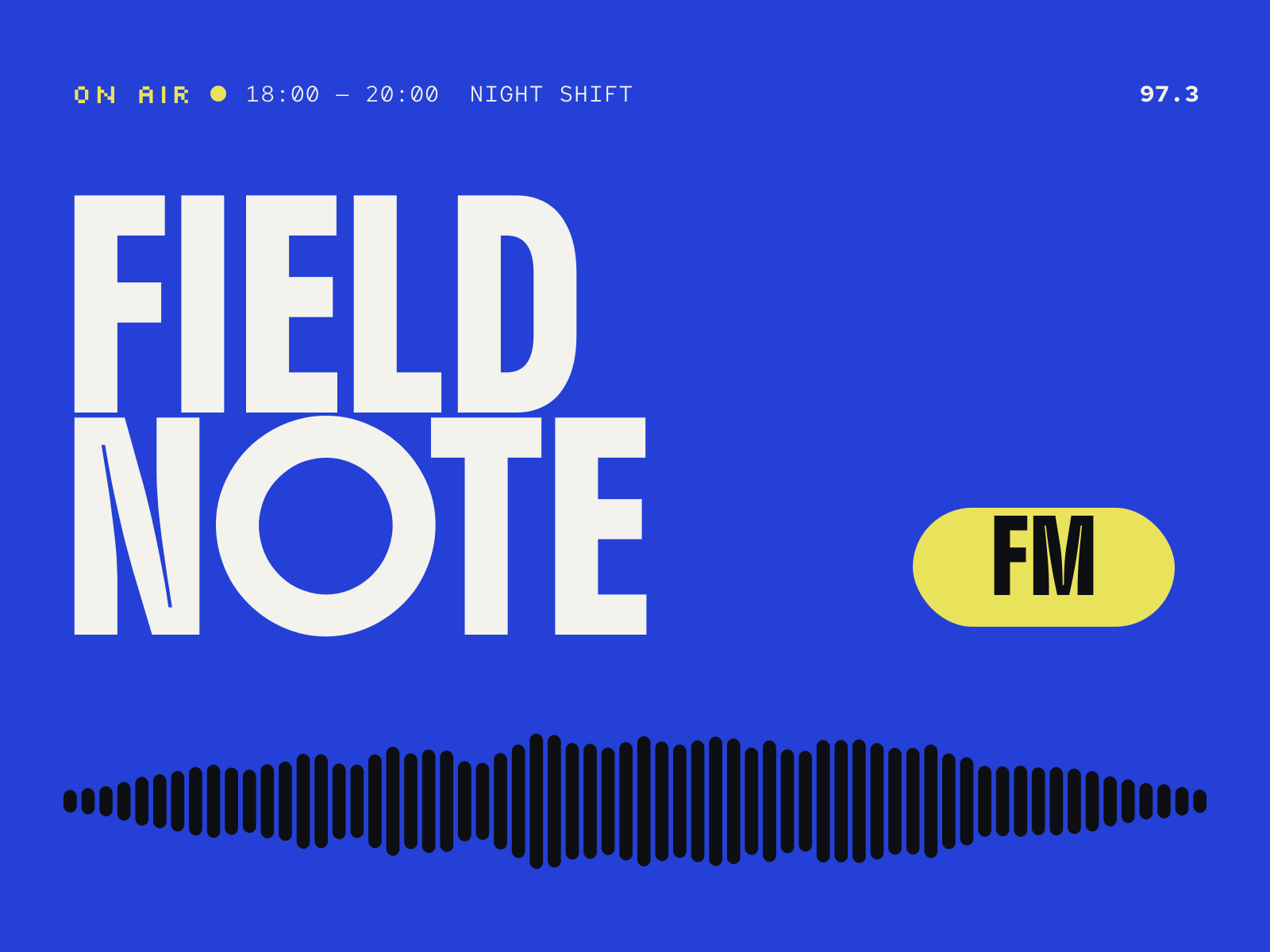
Brand identity, Motion, Web design
A loud, living identity and schedule site for a community radio station.
View case study: Fieldnote FMContact
Got something that needs character?
Tell me what you’re making and where it needs to go — a new identity, a website, or both. Email is the quickest way to reach me.
wajuogunde@gmail.com