Fieldnote FM
Concept — self-initiatedA loud, living identity and schedule site for a community radio station.
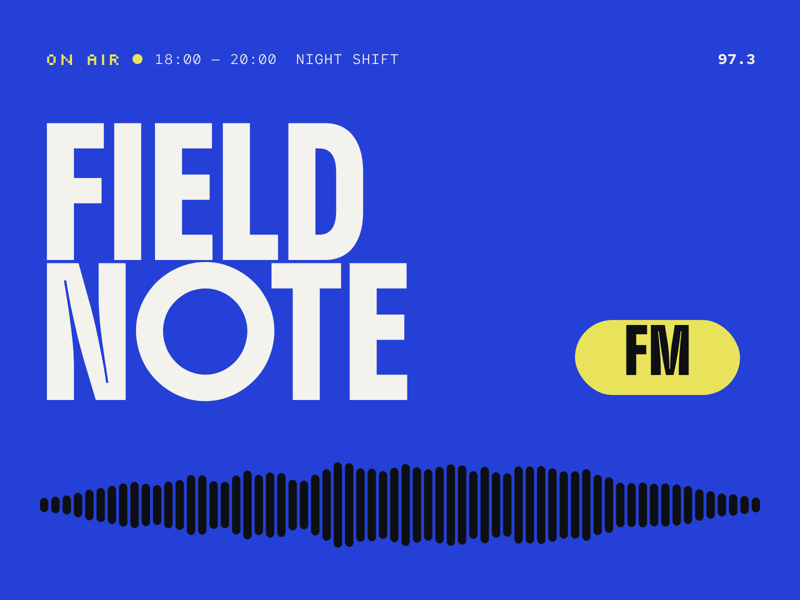
Context & challenge
Context
Fieldnote FM is a concept: a fictional, volunteer-run community station broadcasting local shows, live sets and neighbourhood news.
Challenge
Community radio is made by dozens of people with different tastes, so the identity had to be strong enough to hold together posters, stickers, show artwork and a website without one designer controlling everything.
It also needed to feel live — radio is happening now, not archived.
Creative direction & rationale
Direction
The logo is a broadcast sampled into nine rounded bars. In print the bars are fixed; on screen they move with the station’s signal, so the logo itself shows the station is on air.
A very heavy display face gives volunteers something bold to set big, and a single cobalt makes anything instantly recognisable as Fieldnote, whatever else is on the page.
Rationale
The system is deliberately simple to use: cobalt, the bars, the wordmark. Anyone can make a show poster that looks like it belongs.
On the website, the live player is always the first thing on the page, and the schedule is a scannable grid where the current show is the only thing in cobalt.
Visual identity
Waveform / wordmark / colour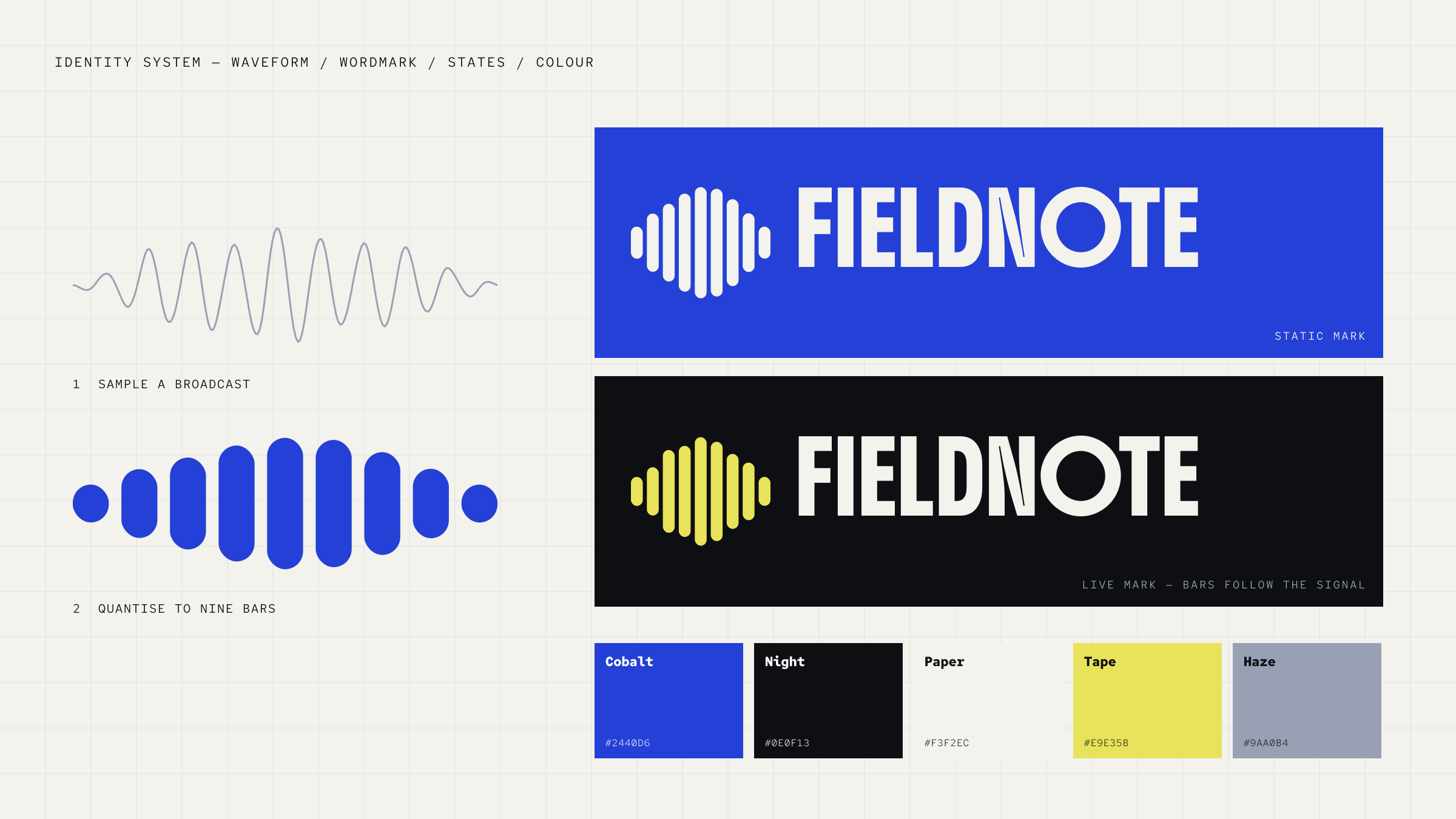

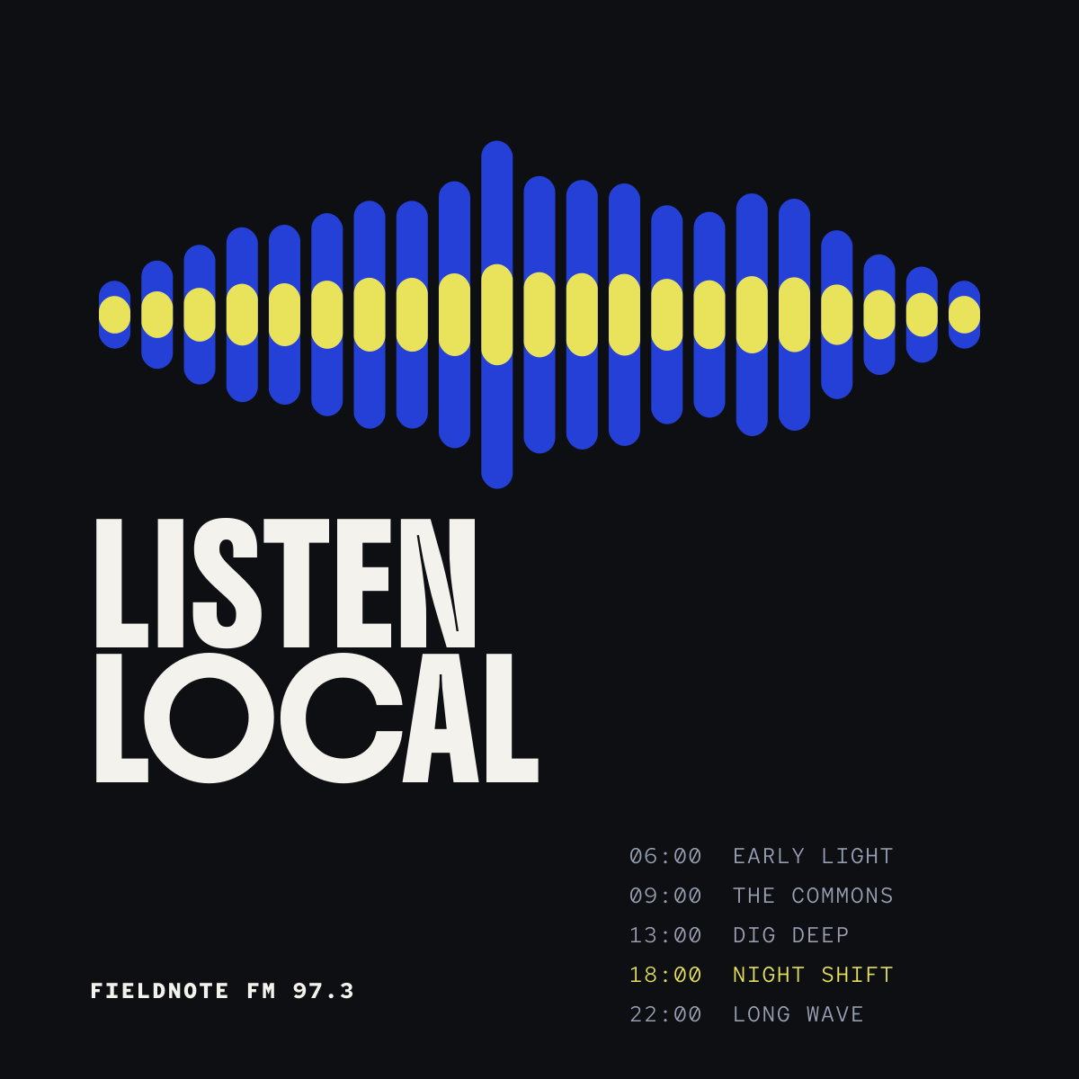
Digital execution
Schedule site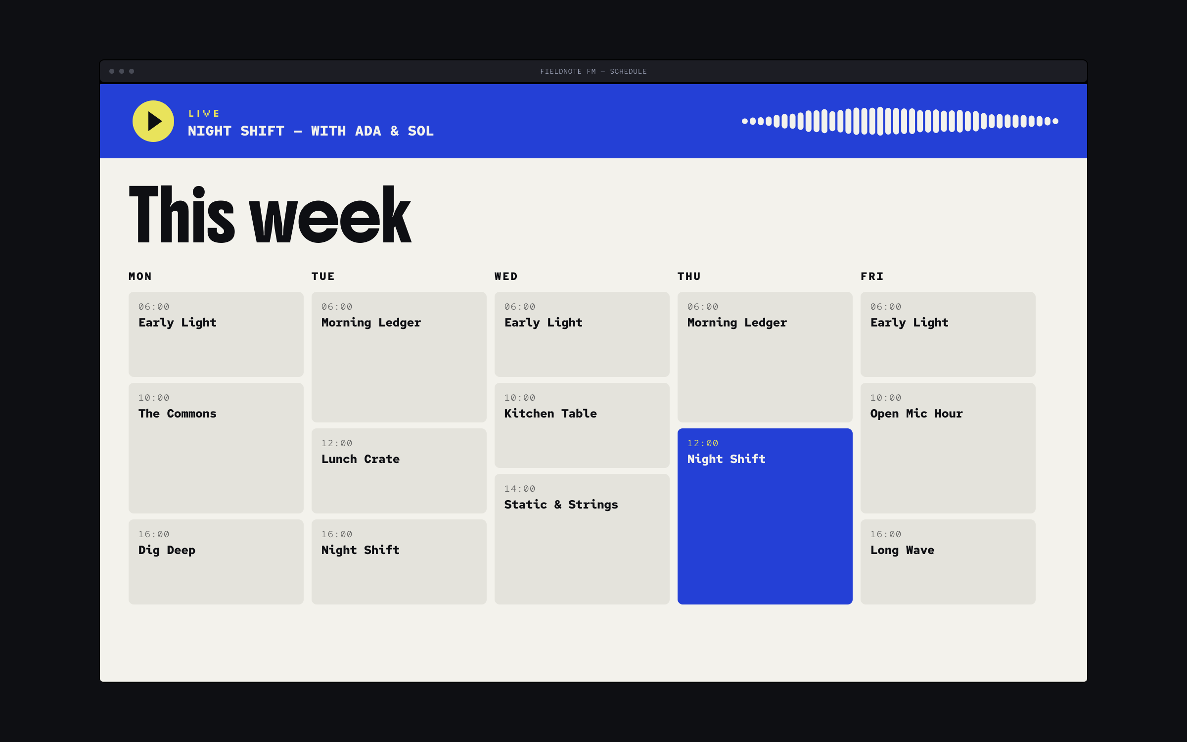
Palette
- Cobalt#2440D6
- Night#0E0F13
- Paper#F3F2EC
- Tape#E9E35B
- Haze#9AA0B4
Cobalt is the station. Tape yellow is for “live”.
Deliverables
Concept — no client results to report- Waveform logo and wordmark
- Live logo motion study
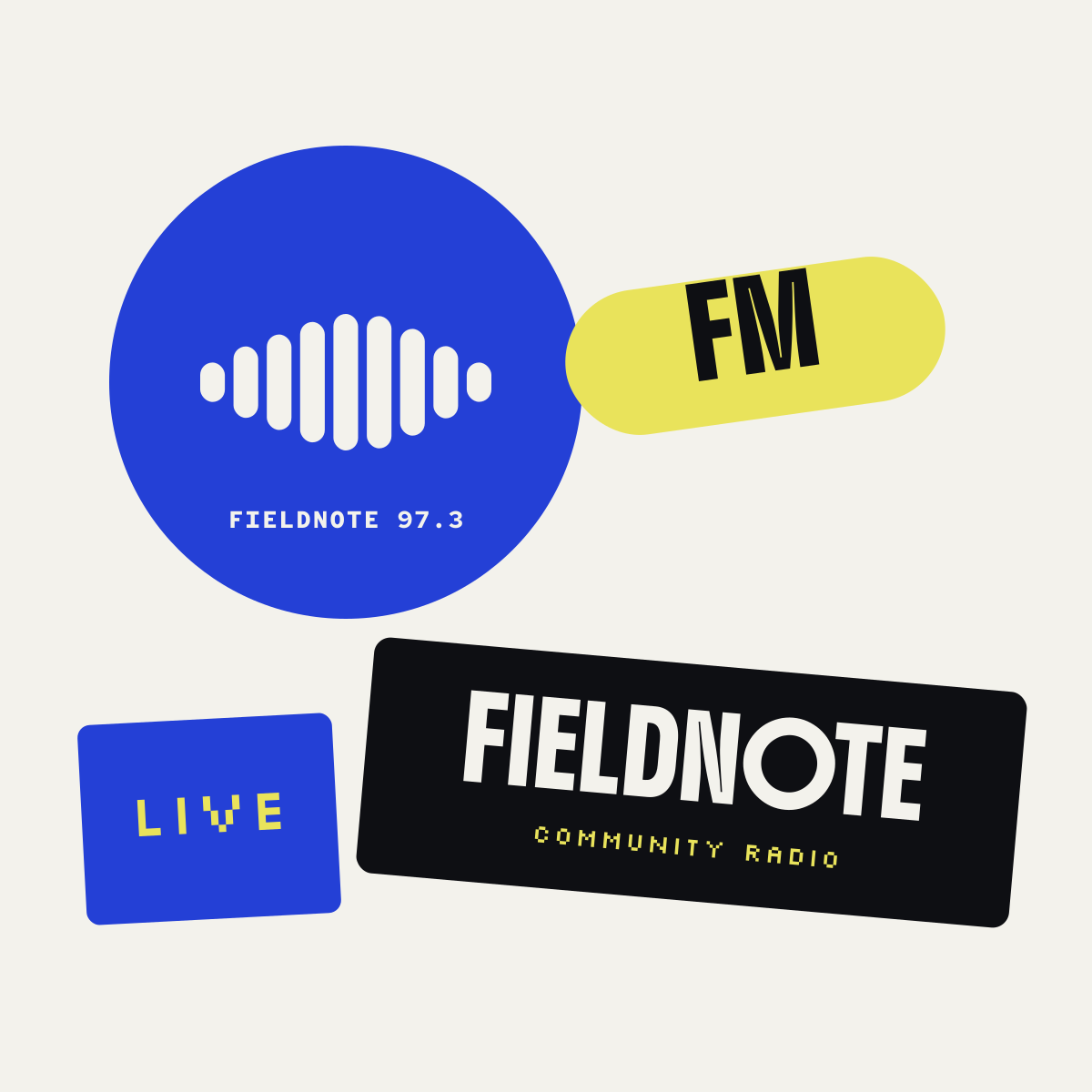
- Poster and sticker toolkit
- Schedule website design
Next project 01/03
Back to all work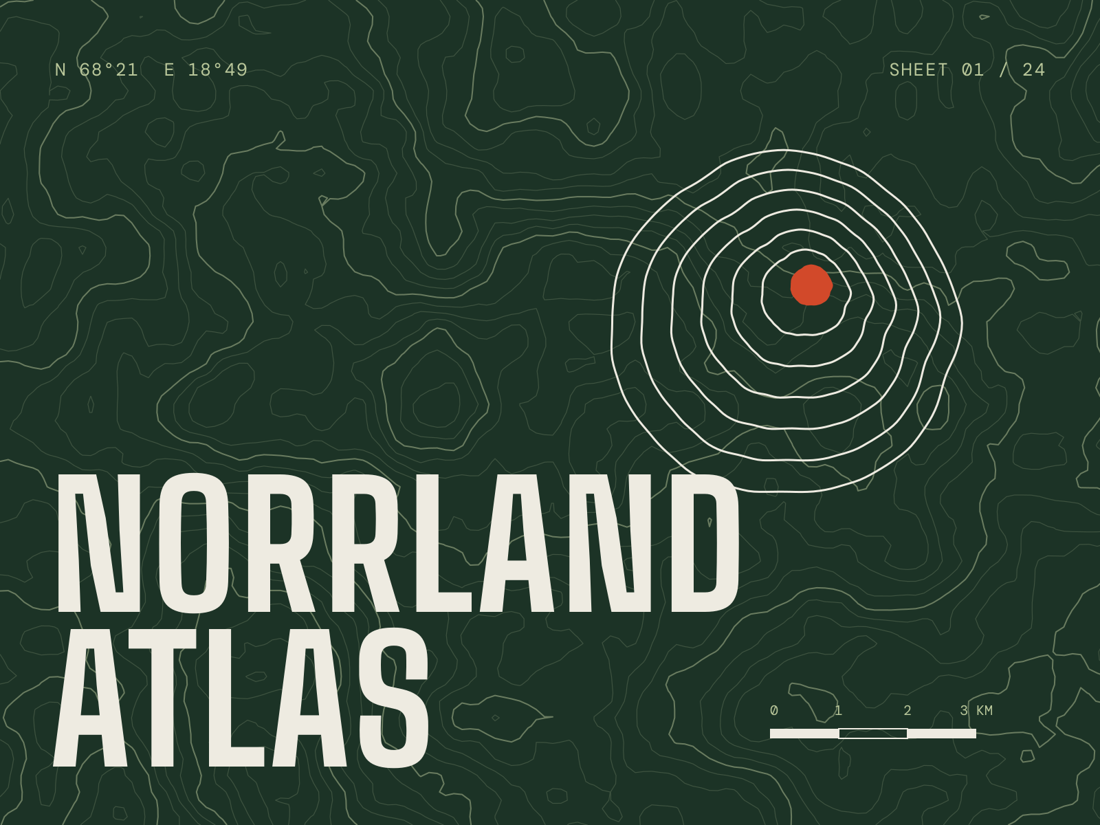
Brand identity, App design
An identity and companion app for a trail-mapping service, built from the contour line up.
View case study: Norrland AtlasContact
Got something that needs character?
Tell me what you’re making and where it needs to go — a new identity, a website, or both. Email is the quickest way to reach me.
wajuogunde@gmail.com